
How to Coordinate Paint Colors Throughout Your House

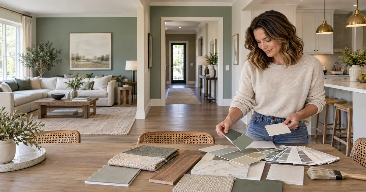
Imagine living in a colorless world. Everything would seem monotonous and boring. Each shade of the color spectrum brings life and personality. And that exactly goes for homes as well. The right color combination improves your property’s aesthetic and makes you love it even more. Most homeowners approach paint color room by room. You choose something you love for the living room, then try to find something that works in the adjacent dining area, then realize halfway through the hallway that nothing is quite speaking to anything else. The house feels like a series of separate decisions rather than a unified home.
Learning how to coordinate paint colors throughout your house is one of the most transformative skills in interior design because it is not actually about any individual color choice. It is about building a framework, a palette with a logic behind it, so that every room feels intentionally related to every other. This is how professional designers think about color, and it is how your home can finally feel complete.
Start With a Home Color Palette, Not a Paint Color
Before you open a fan deck, establish a home color palette. Think of it the way a brand designer thinks about a style guide: a defined set of hues, tones, and finishes that governs every color decision throughout the house. Your palette should include the fixed finishes you already have or plan to keep: flooring, countertops, tile, cabinetry, because those are effectively colors in the room whether or not they come from a paint pot.
When you understand your full material palette, you can see which undertones are already dominant in your home. Warm oak floors and cream stone countertops tell you that warm-undertoned paint colors will harmonize with the space. Grey concrete tile and cool-toned cabinetry point toward cooler, more neutral wall colors. The key to understanding how to coordinate paint colors throughout your house is always to start with what already exists before selecting anything new.
Establish a Neutral Base in Connected Spaces
The most reliable approach in an open-plan home or a home with rooms that flow visibly into one another is to establish a consistent neutral across all connected areas: hallways, the main living zone, the entry. This creates a continuous thread that makes the home feel larger, more cohesive, and easier to layer color into.
In a more compartmentalized home where rooms have clear boundaries, you have more freedom to vary the palette from room to room. But even then, the colors should share an underlying tone, either warm or cool, so that moving from one room to another feels like a deliberate shift rather than a disconnection.
Transition Colors From Room to Room With Intention
When two differently painted rooms share a doorway or cased opening, the transition deserves a decision. A common and clean approach is to paint the inside of the casing the color of the room it opens into. This creates a frame that contains each color within its own space.
If the transition is between two bold or saturated colors, a neutral threshold, a hallway, a landing, or an entry painted in a quieter tone gives the eye a place to rest between statements. The principle is the same one that guides a well-designed gallery wall: contrast needs breathing room to work properly.
Repeat Elements, Not Colors
One of the most elegant techniques in paint color coordination throughout your house is the distinction between repeating colors and repeating design elements. You do not need to use the same color everywhere to achieve cohesion. But repeating a tone, a quality, or an element in different rooms creates the visual thread that ties them together.
A deep green in the study, sage in the bedroom, and a botanical print in the hallway do not share a color. They share a reference: the organic world. That shared reference is enough to make the home feel considered and connected without being monotonous. A home that uses exactly the same color in every room achieves unity at the expense of personality. The goal is to coordinate, not to match.
Map It Before You Paint It
A simple but powerful exercise is to sketch or note the color of every wall in every room, including the adjacent spaces visible through doorways. This map lets you see where transitions are abrupt, where repetition is becoming monotonous, and where a color decision in one room creates problems in the next. It is the difference between choosing colors in a vacuum and choosing them as part of a system.
The Professional Difference
Color coordination across a whole home is the kind of decision that benefits enormously from a professional eye. The undertones that create dissonance between rooms, the finishes that work in morning light but fail by afternoon, the relationship between wall colors and fixed finishes that makes or breaks a space: these are the details that a trained interior designer evaluates as a matter of course.
Rose Ann Humphrey of Home Life approaches paint and finish selection as part of the full design direction of every project, never as a standalone decision. Her practice spans decades of work across New England and now throughout Charleston and the surrounding islands. Her goal is to give you a home that you love as you live.
That decision can start with a call. Make your property stand out from monotony with the right color combination with the aid of someone with experience bringing properties to life.